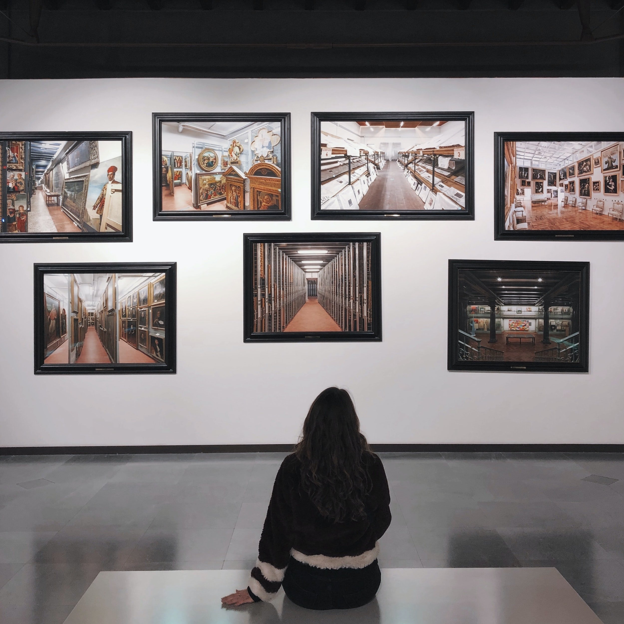
Empowering Art
I’ve been making time recently for visiting a number of local exhibitions that have caught my eye. My criterion for enjoying an exhibition is really quite simple - I hope to come away having learnt something new, or thought more deeply about something I wouldn’t have otherwise. Whilst there are plenty of exhibitions that I look around and quickly come away from without a second thought, I suppose I am always hoping for an impact that is longer, more, than the in-the-moment one whilst at the exhibition.
Three exhibitions have done more for me recently:
1) The Dangerous Pockets project, as I saw at the Maker’s Festival in Norwich in March. https://www.paulamacgregor.com/dangerous-pockets-project.html
2) Empowering Art at the Sainsbury Centre, Norwich. https://www.sainsburycentre.ac.uk/whats-on/empowering-art-indigenous-creativity-and-activism-from-north-americas-northwest-coast/
3) The Dementia Darnings, Norwich Cathedral, March. http://www.jennidutton.com/dementiadarnings.html
Every one of these made me think more deeply about something, made me question too, and especially in the case of the latter two, made me feel something quite powerful. All of these impacts are powerful in their own different ways.
What especially interests me at the moment is the interplay between the text about the artwork and the artworks themselves, and how these choices of text - what to leave in, and what to leave out - affect or influence the viewer.
“There's the story, then there's the real story, then there's the story of how the story came to be told. Then there's what you leave out of the story. Which is part of the story too.”
Margaret Atwood, MaddAddam
The Sainsbury Centre has a section of gallery that offers only a title and date for a piece. Nothing more. If you want more, you need to take a seat and find the object in the exhibition catalogue. This minimal approach to text is deliberate, intending to display the objects as they may have been displayed in Lord and Lady Sainsbury’s home as their personal collection.
In the Dangerous Pockets exhibition, there is a sign sharing the ‘Dangerous Pockets’ poem that was the original source of inspiration for the project and the resulting artworks. I wonder how people would view the exhibition differently without that contextual information, that window into the artist’s initial idea?
In the Empowering Art exhibition, there are larger signs of information at key points throughout the galleries, as well as smaller gallery wall plaques for each individual piece. I also joined a tour of the exhibition with a gallery guide - in which there was even more information given that I felt I really benefitted from. Information that was in addition to that given on the walls.
In the Dementia Darnings exhibition, text was minimally displayed alongside the artworks, but there were titles and some additional information at key points through the room. The one I found especially powerful was one that described the reactions of key people associated with the exhibition - the artist and her elderly mum. The personal and open nature of the pieces themselves, and of the text that had been written to accompany the pieces, felt so appropriate and respectful.
In all of these, I was very conscious of the way in which I responded initially to seeing the images alone, and then how that response altered or changed with the addition of the text information. I come back to wonderings that text is powerful on its own. Images are powerful on their own. But together, they can offer something more.
And back to Sydney Smith’s suggestion, referenced in my previous blog, that as an illustrator “you come to an understanding that you are only as good as the collaboration between the text and image.” Collaboration. Partnership. Complementing each other. Not overpowering each other. Highlighting key messages. Delivering messages together, in different ways.
